Washington Mystics Nike Rebel Edition
Overview
Each season, in collaboration with Nike, WNBA teams across the league release their Nike Rebel Edition uniforms – an alternate uniform design highlighting the strength and resiliency of women everywhere. In 2023, we helped the Washington Mystics unveil their version: inspired by civil rights activist, feminist, and educator Nannie Helen Burroughs and her commitment to women’s rights and equality.
The Challenge
We sought to create a campaign in support of the special edition uniform release that celebrates the legacy of Nannie Helen Burroughs, and honors the contributions of all women trailblazers. Acknowledging these remarkable women of past and present, we created a campaign identity, merchandise set, and microsite reinforced by campaign-specific messaging drafted by our team. The final campaign was referential – historic in a sense – but fresh and contemporary enough to work across both digital and print outputs within the evolving WNBA market.
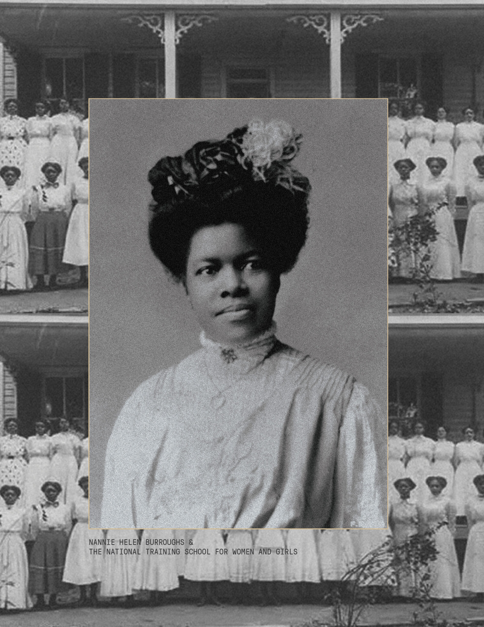
Honoring the legacy of Nannie Helen Burroughs
Ms. Nannie Helen Burroughs was a woman who defied the roles and expectations assigned to her. From starting the National Training School for Women and Girls and subsequently, one of the first women’s basketball teams in D.C., she would never allow the world to tell her who and what she should be. Her trailblazing is a testament that true rebels will always chart their own paths.
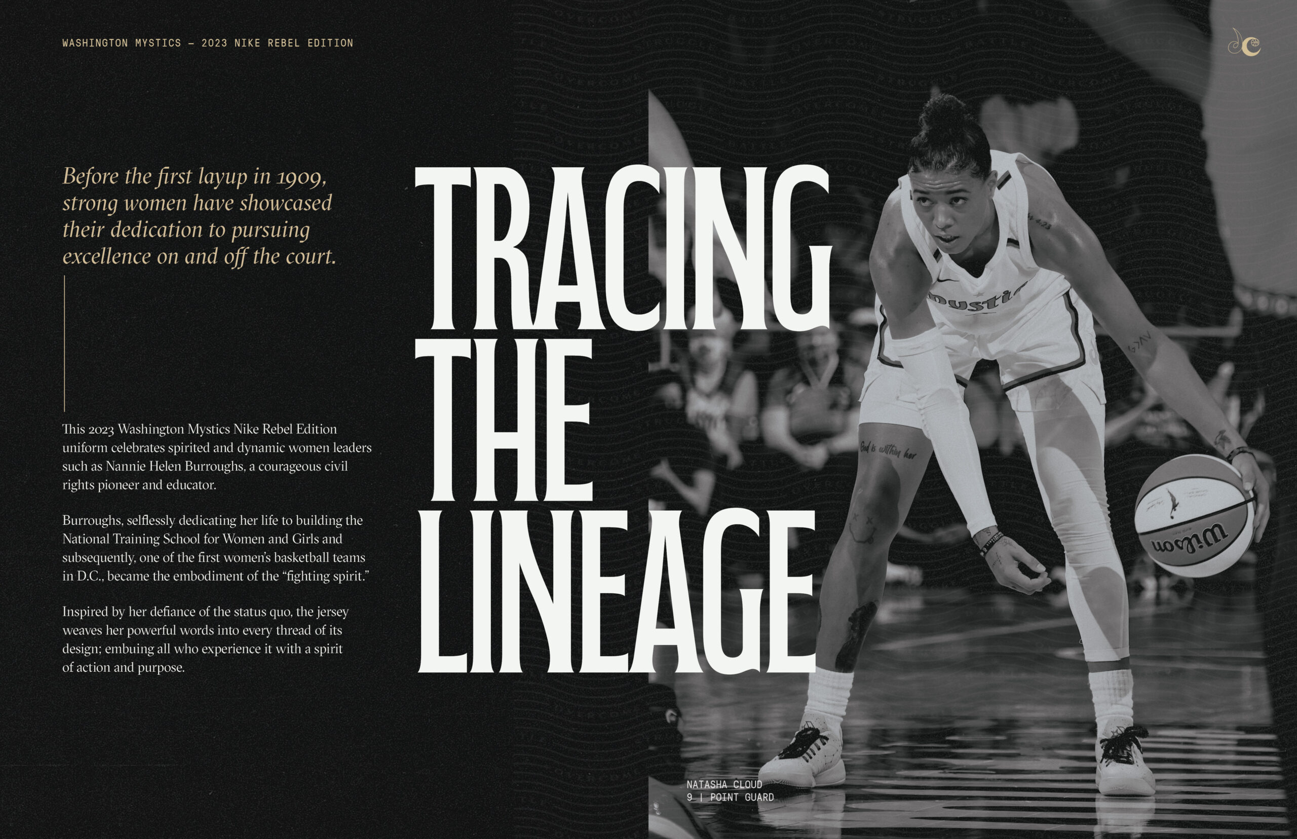
It’s this exact spirit that laid the groundwork and served as the guiding light for the 2023 Mystics Rebel Edition Campaign, across both messaging and visual outputs.
The Concept
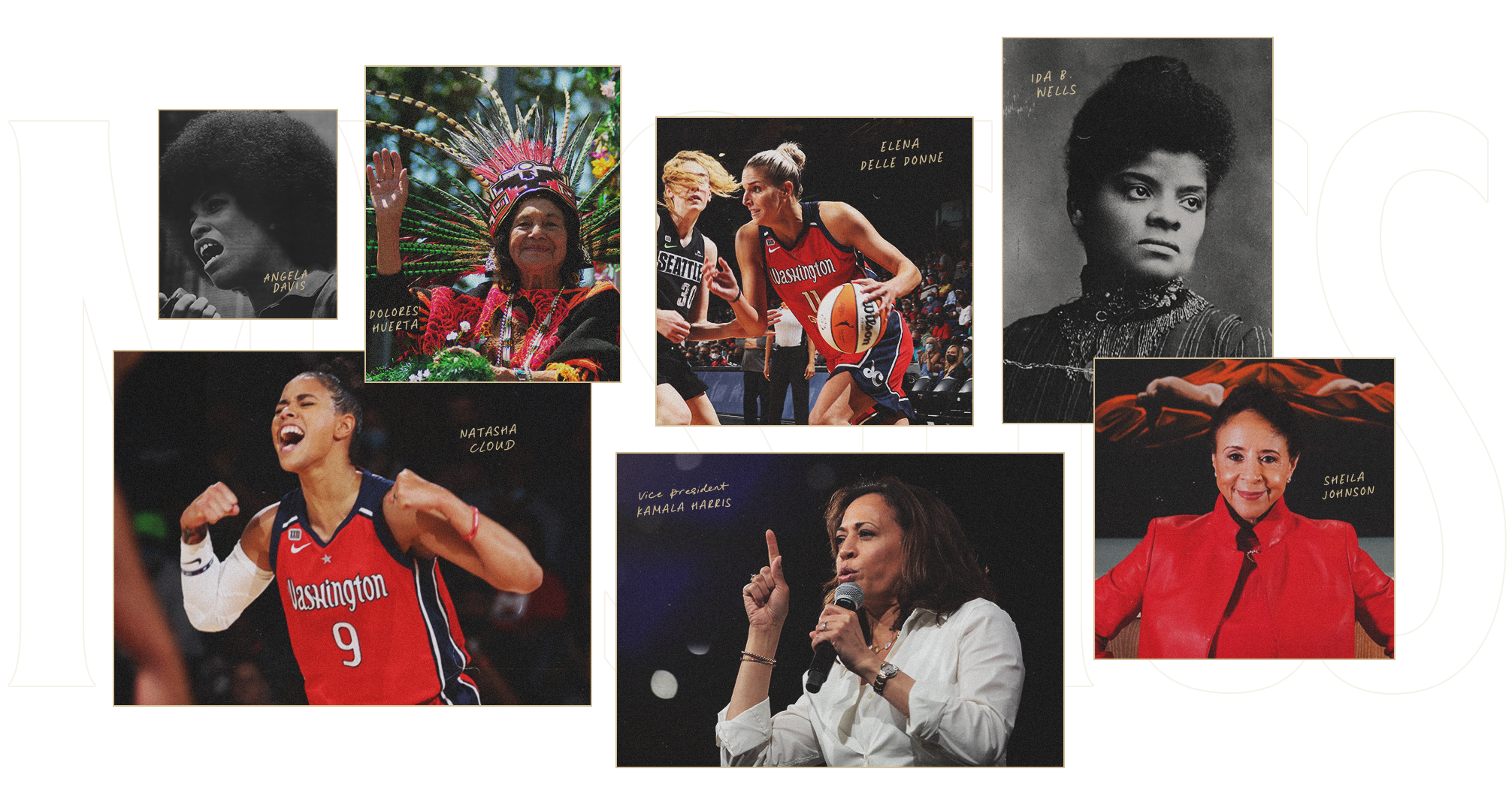
This Washington Mystics campaign is a resounding call for leaders everywhere. It is a celebration of bold women defying definition. While highlighting Ms. Burroughs story in this campaign, it was equally important to highlight women trailblazers everywhere, from the board room to the locker room.
Messaging
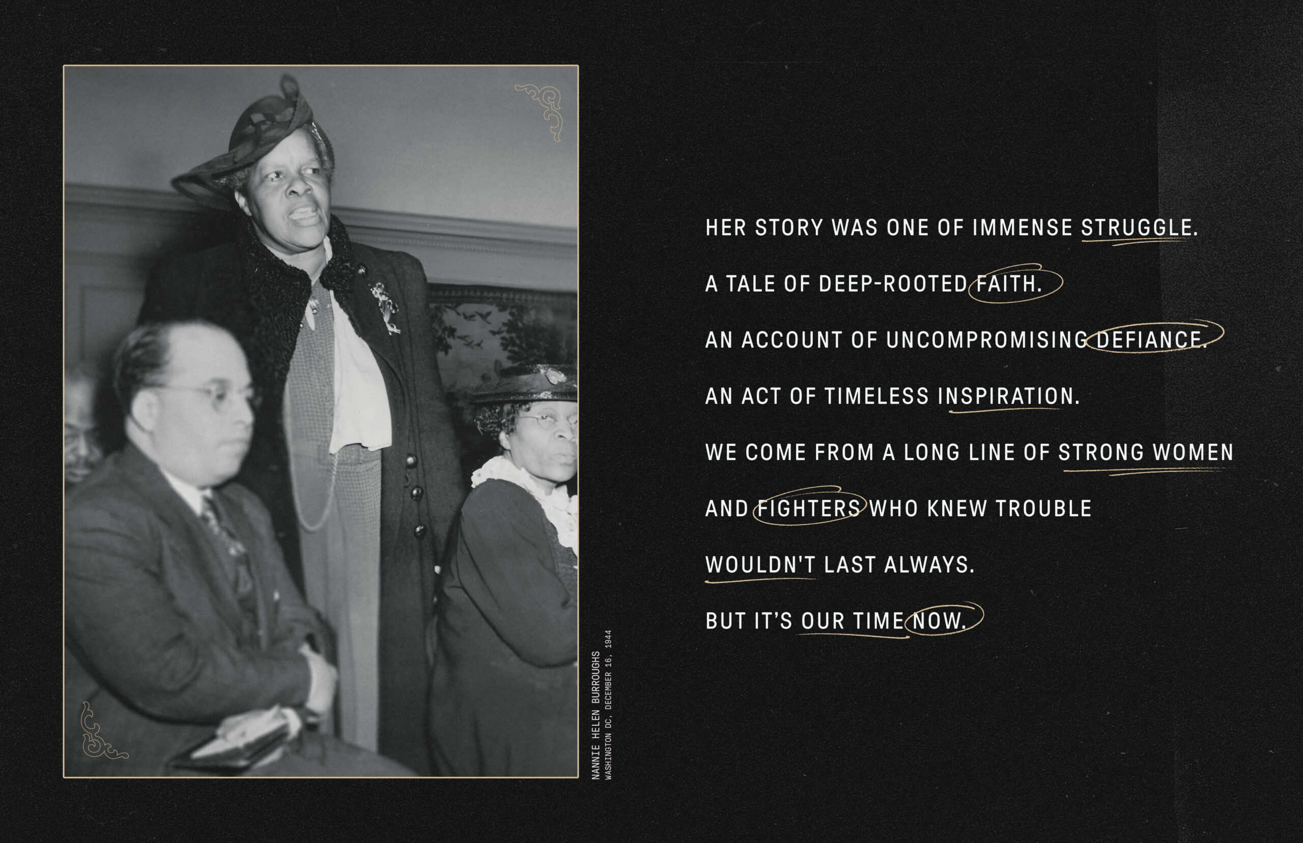
Nannie Helen Burroughs was an orator. She was a playright, an educator, an entrepreneur, an activist — she was someone who could move you with her words. For our messaging and scripting, we rooted ourselves in the writings and speeches of powerful women whose words and voices have shaped history, inspired movements, and shaken the status quo. In the spirit of these women, we wrote a campaign that can invoke new resonance, energy, and belief in generations of Mystics fans to come.
Campaign Identity
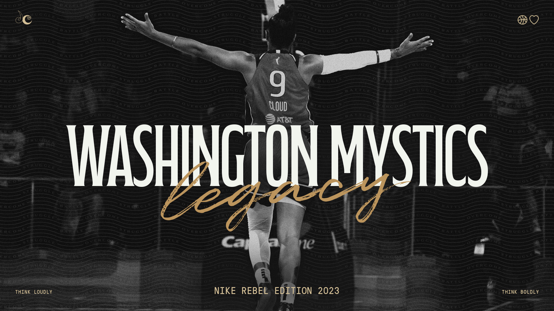
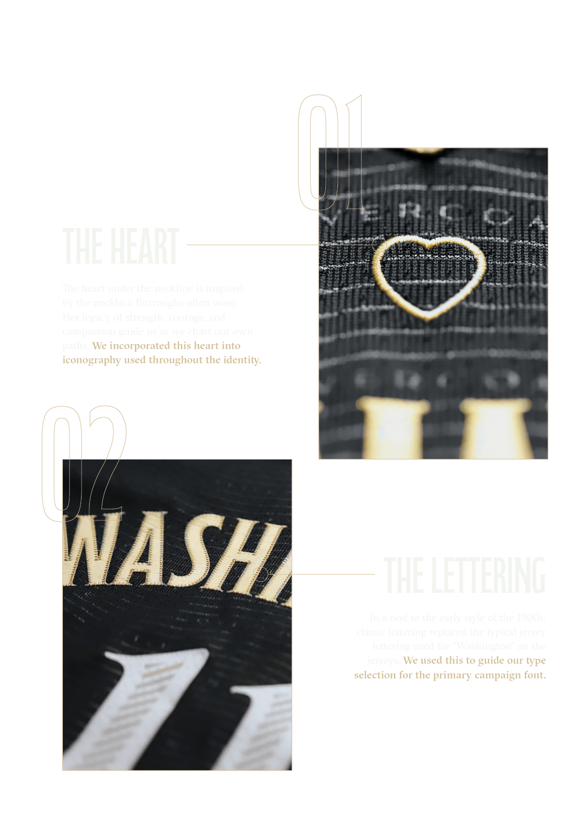
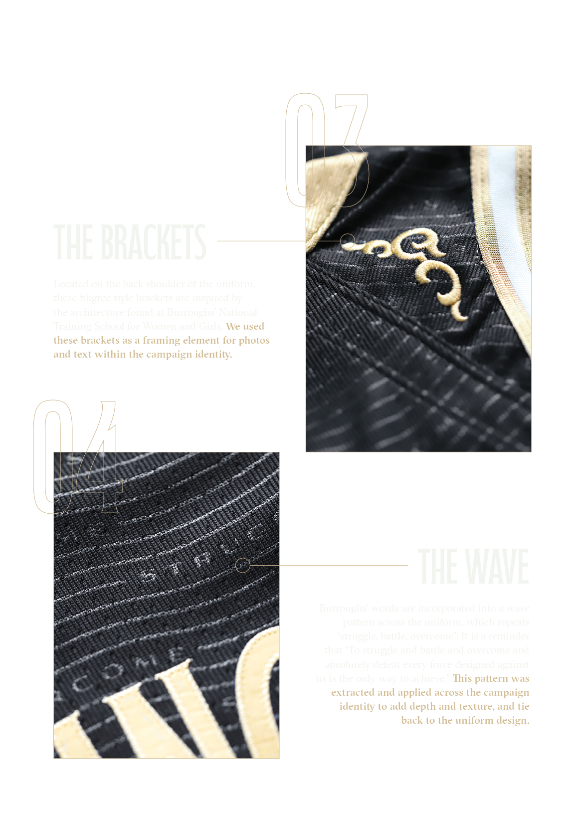
The visual identity for the campaign was largely informed by elements found on the Rebel Edition uniforms designed by the Nike team. The uniforms – which introduce a brand-new black and gold colorway – are adorned with several referential design elements that tie back to the story of Ms. Nannie Helen Burroughs. Our team extracted these elements, building a comprehensive design library that directly ties back to the uniform design and Ms. Burroughs’ story. We applied these elements in numerous ways throughout the campaign identity.
Logo & Color Palette
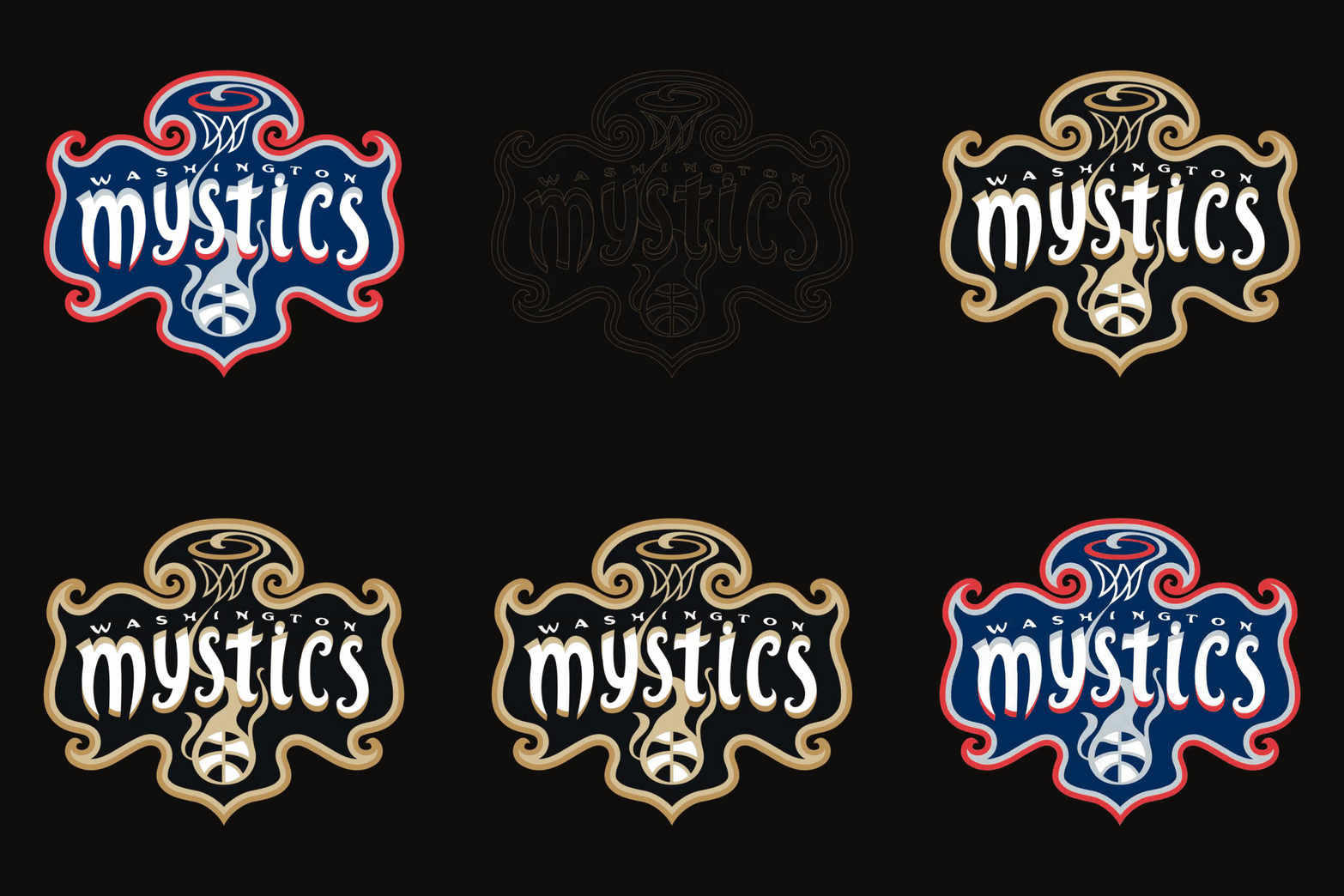
A special edition logo, for a brand-new Mystics colorway
As a new colorway for a Mystics uniform, the black and gold colors convey a story about strength, sophistication, and trailblazing a path to change. We presented the Mystics with a re-envisioned Mystics logo, recolored for uniformity with the Rebel Edition campaign. Capitalizing on the equity of the original Mystics logo, but immediately recognizable as part of this special campaign, the newly recolored logo was received with open arms by the Mystics Marketing team.
Typography
When building the campaign identity, our team was presented with an exciting opportunity to build on the uniform design and introduce new elements that didn’t previously exist. We created a typographic palette that introduced several new typefaces never before used by the Mystics team. This included a headline font that directly references the uniform lettering optimized for both digital and print outputs; secondary typefaces for both subheads, body, and quotes; and completed by two handwritten fonts that provided contrast, layering, and a personalized touch – a nod to the trailblazers who wrote themselves into history.
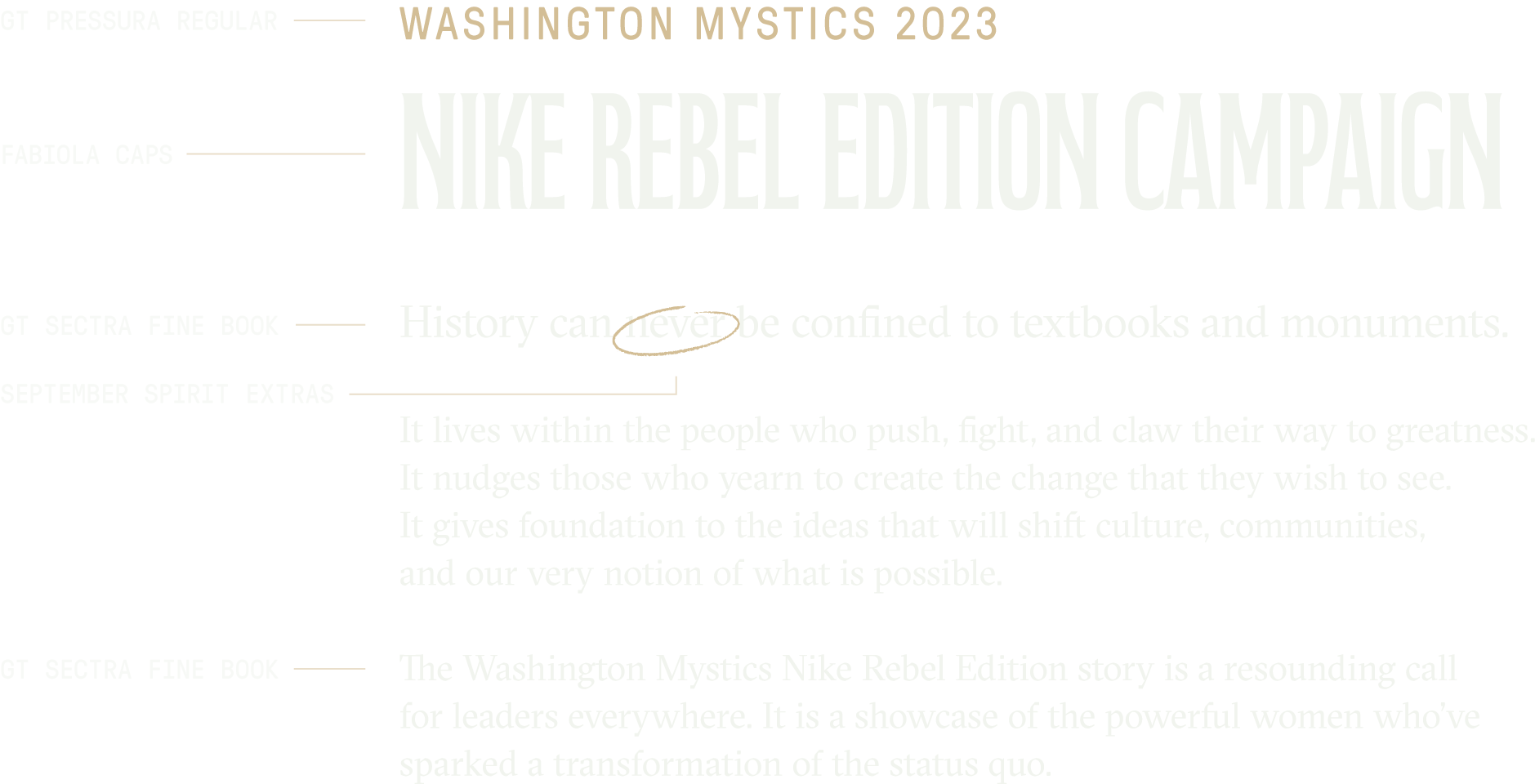
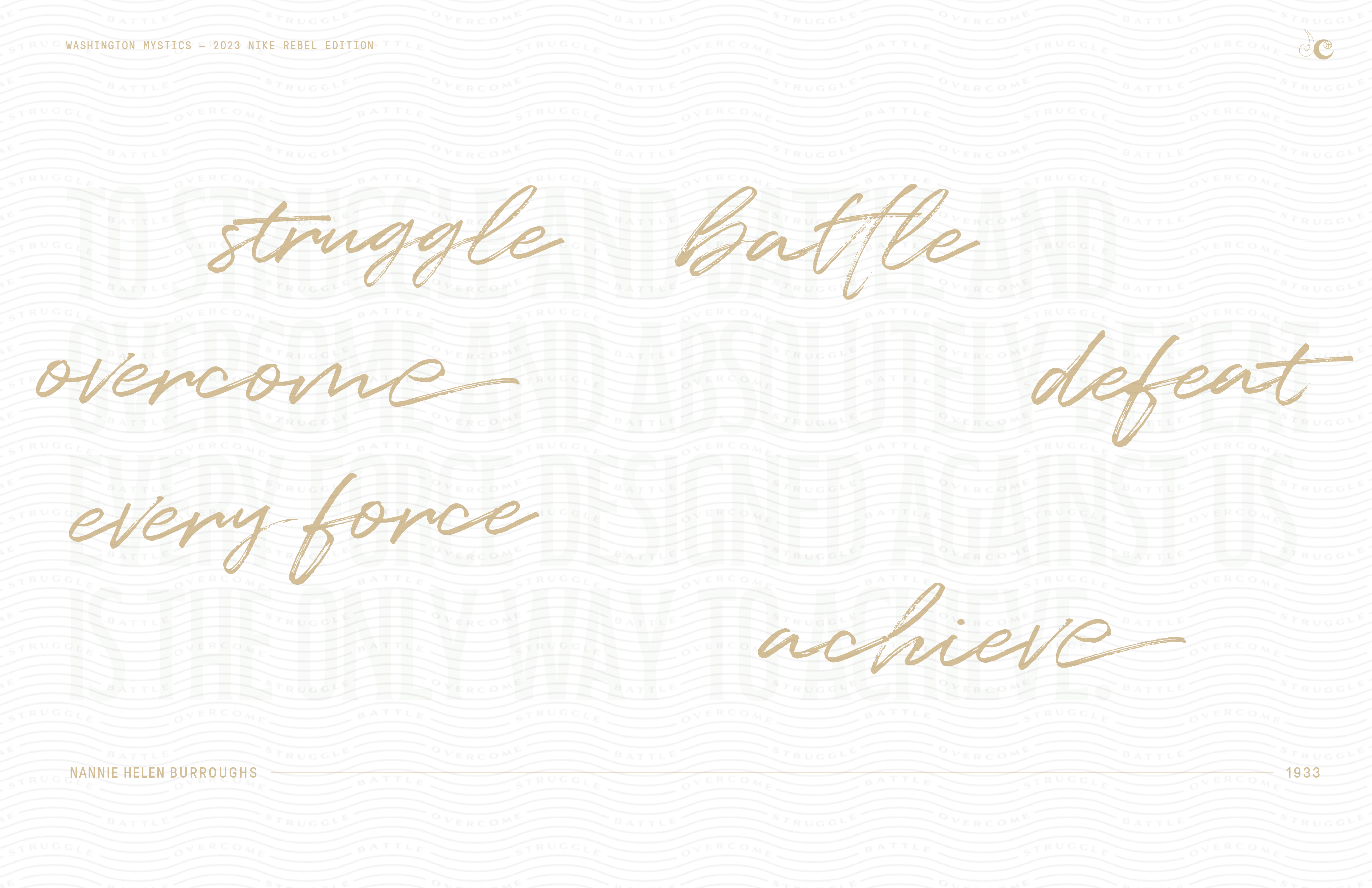
Photo Treatment
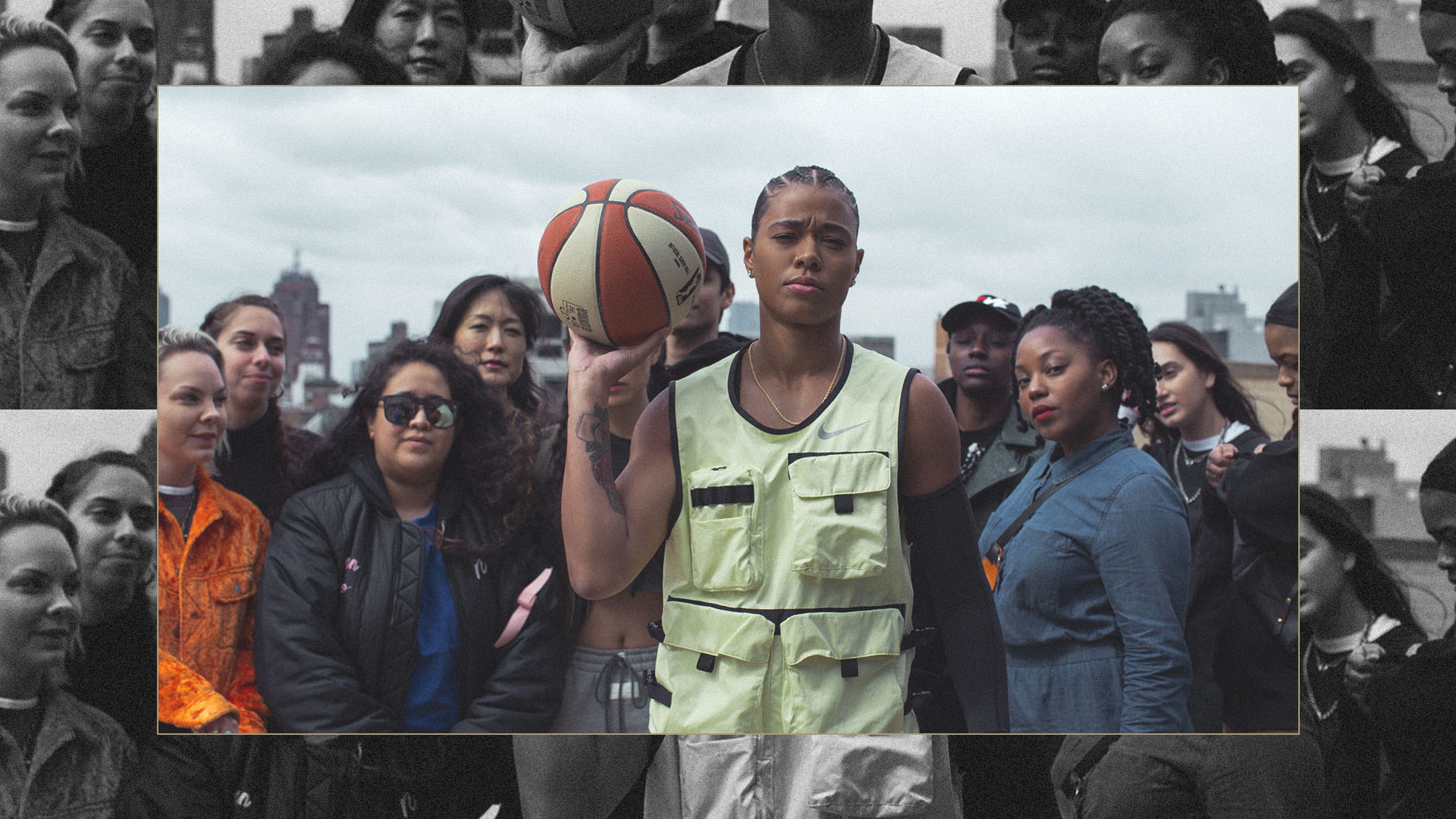
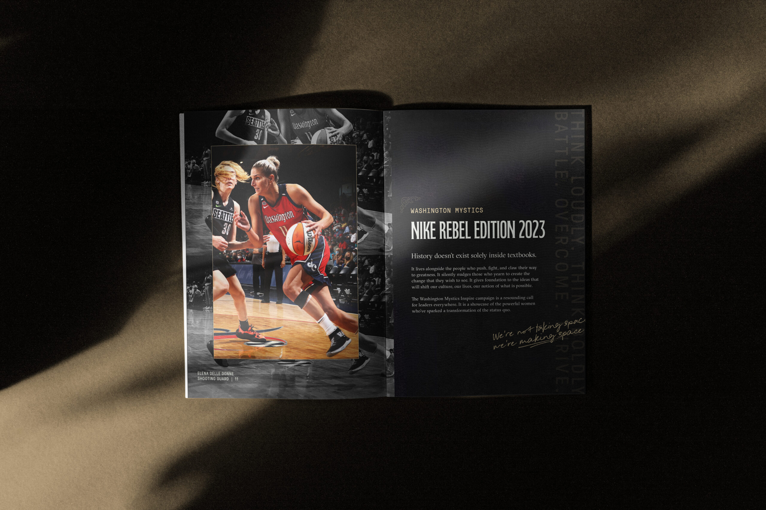
Part of our design challenge was creating a system that can easily incorporate photographic imagery in a powerful and referential way. It had to be able to accommodate both Mystics players in action, as well as lifestyle and historic images. It also needed to be flexible enough to work across different sizes and outputs, from small web banners, to full-bleed editorial spreads. Our team came up with a layered photo treatment that combines both black and white and full-color photography, referential of old-school basketball catalogs and showcasing our subjects strength.
Microsite
The culmination of the campaign identity and messaging lived within a Mystics Rebel Edition Microsite designed by our team, that not only showcased the brand, but took viewers on a journey through the uniform design, the story of Ms. Burroughs, the Rebel Edition game schedule where fans could see the uniforms in action, and ultimately provided the option for viewers to purchase their own Rebel Edition jersey.
Rebel Edition Merch
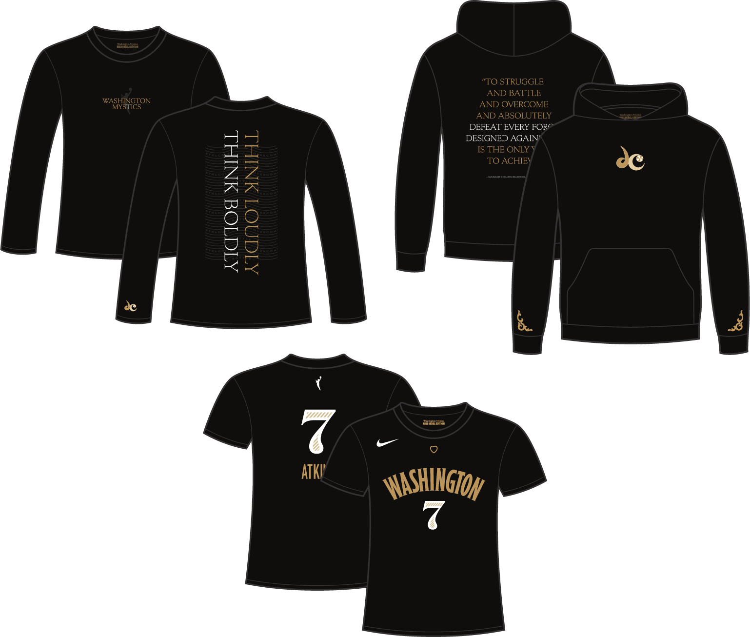
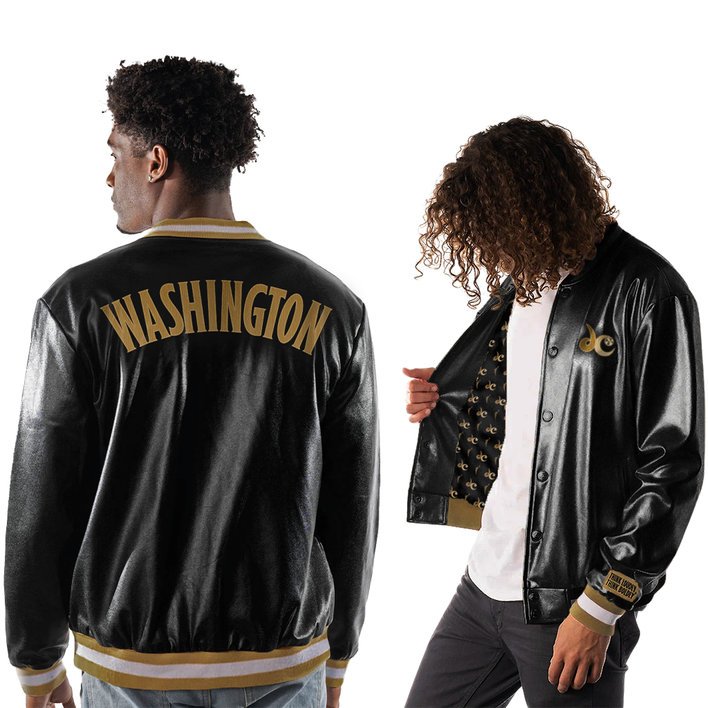
The campaign would not be complete without special edition merchandise that fans across the map could rep in their hometowns. We created a capsule of four Rebel Edition items, including a hoodie, long- and short-sleeved shirts, and a custom black and gold bomber jacket featuring details from the uniforms.
Social Extensions
Creating a flexible and dynamic system that the Mystics marketing team can run full-court with.
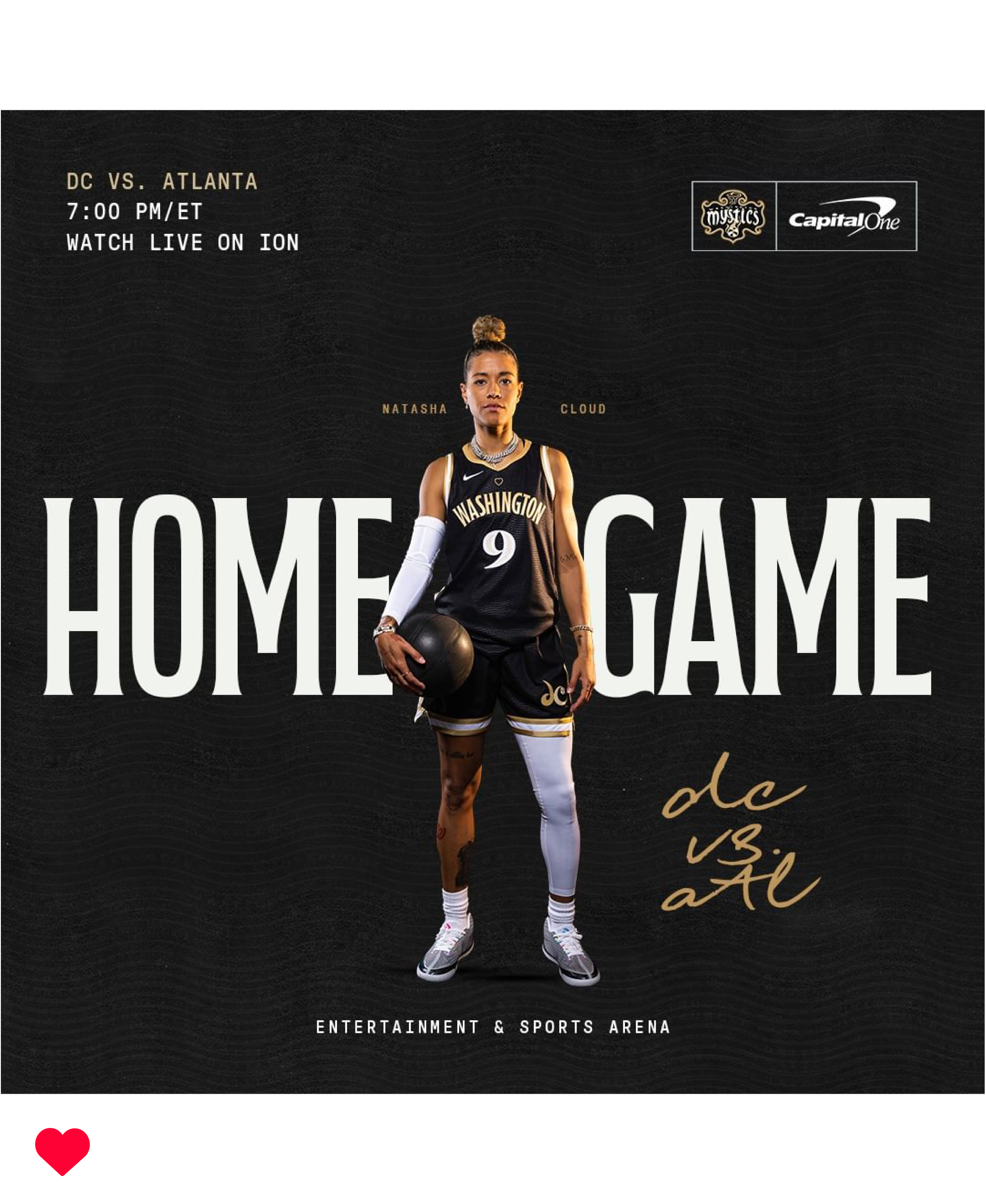
A unique challenge we faced with this project was building a comprehensive brand package that could easily be handed off to the Mystics marketing team for final implementation and application across all of their different needs. Our team created detailed brand guidelines, an initial set of collateral items, and sample social/digital graphics.
Then we sat back and watched the Mystics media team run wild with the elements we provided (safe to say, we love the results). Building a system that’s flexible and scalable enough to be successfully used by an outside design team was the greatest measure of success.
*All social images are credited to and designed by the Washington Mystics social team using brand elements provided by Ghost Note

“The Rebel campaign was a success, both internally with staff and players, and externally with our fans. This is especially true when we execute our ‘Rebel Games.’ The brand identity really came to life in arena with signage, videos, and all of the game entertainment bells and whistles. We have been beyond happy with our results.”
DANA CAMPBELL
DIRECTOR OF MARKETING, WASHINGTON MYSTICS
