Hopelab
Visit the Website
Overview
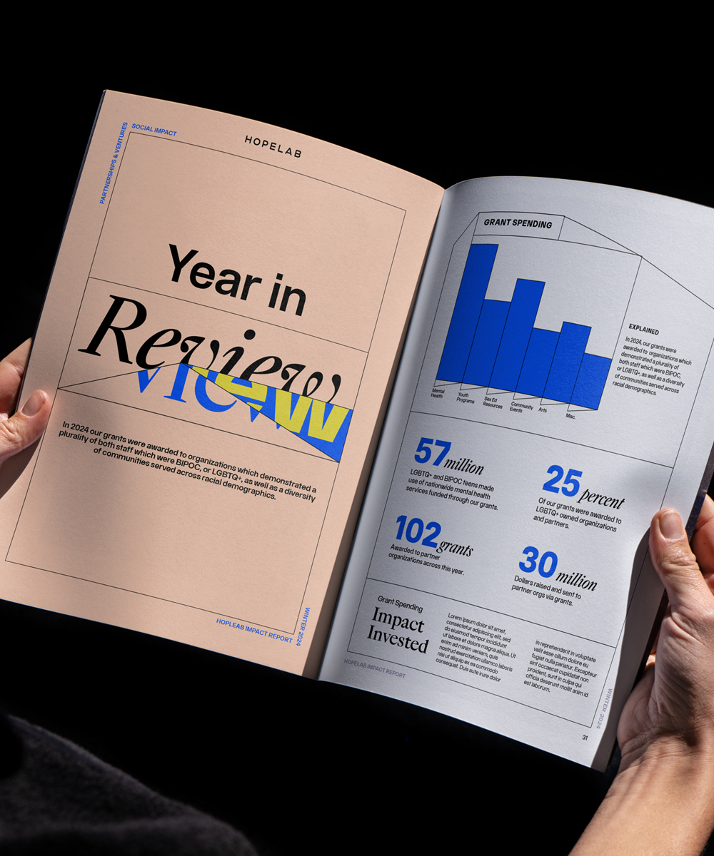
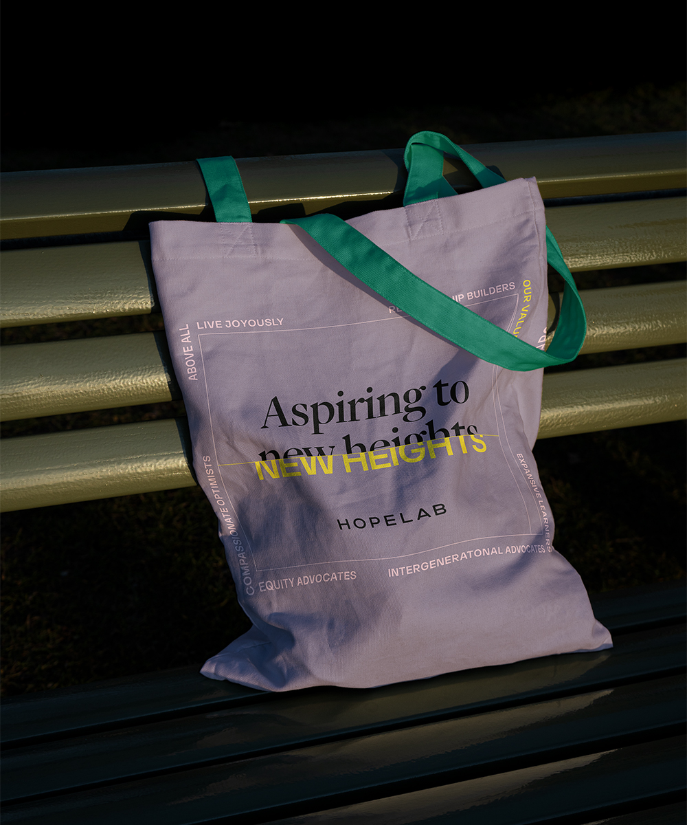
We partnered with Hopelab to create a brand identity that bridges strategic evolution with compelling expression, repositioning them to better advance global youth mental health through authentic engagement.

The Challenge
Hopelab’s strategic evolution had outpaced their brand identity, creating internal and external confusion about their purpose and audience. They needed a holistic realignment to clarify their mission, connect with diverse stakeholders, and develop the emotional range necessary for youth-centered mental health work.
The Solution
Through discovery focused on alignment, consistency, flexibility, and audience needs, we developed a brand framework capturing their commitment to evidence-based innovations for marginalized youth. The identity system embraces a prism metaphor—refracting vision outward—creating a youth-centered, disruptive expression that balances playfulness with mission gravity.

The Concept
Our approach centered on identity realignment that bridges critical gaps between strategy and expression, diverse audience needs, and organizational evolution. The system provides a foundation for expanded impact through both functional clarity and emotional resonance. By creating a flexible yet consistent visual language, we established a platform for Hopelab to effectively invest in innovators, fund youth-centered solutions, and advocate for systems change toward their vision of young people thriving free from mental health barriers.

Brand Manifesto
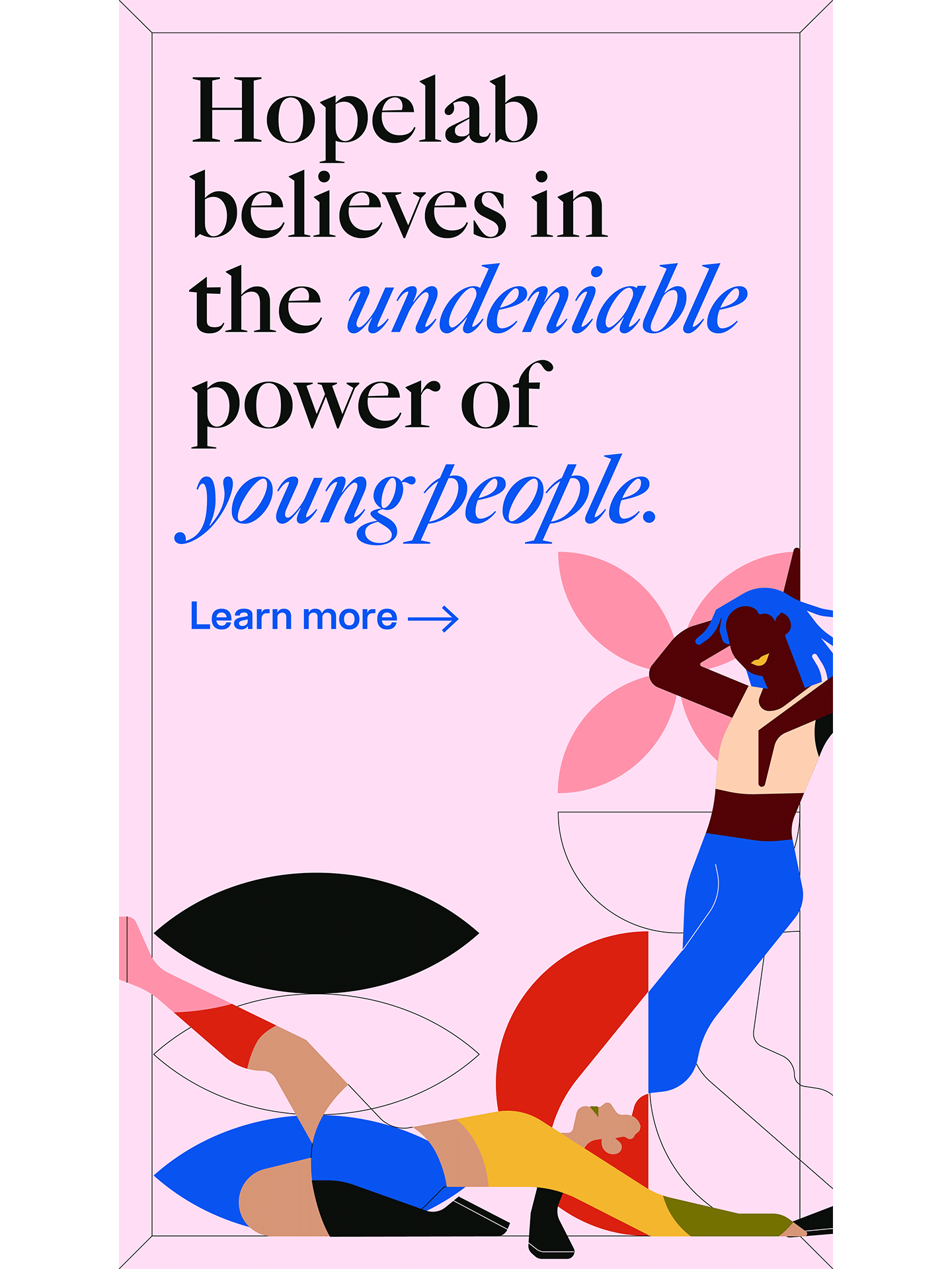
Hopelab believes in the undeniable power of young people. Their vision, joy, and imagination for shaping the world inspires us to consider all the possibilities around us. Their determination to achieve a better future propels our action. All we do is fueled by the belief in their right to thrive.
At Hopelab, we dedicate ourselves to fostering greater mental health and well-being of young people by investing, convening, and sharing. The uncanny, almost magical spirit in the hearts and minds of today’s young people pushes us to reimagine the fullest vision for a better tomorrow.
Creative Direction
Hopelab sees the world through a different lens.
A future where Black, Brown, and Queer young people live joyful and purposeful lives free from barriers to their mental health and well-being. This lens represents the center through which this vision can expand, through many different angles, and become a reality.
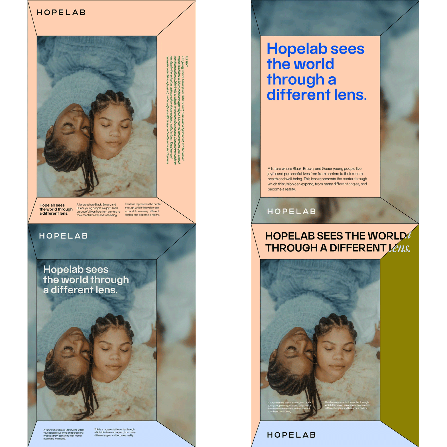
The new brand should be youth-centered, disruptive, and clear. Evoking feelings of inclusion and playfulness. By incorporating unconventional and purposeful elements, Hopelab will ignite and inspire connection and collaboration amongst today’s champions of change and tomorrow’s next-generation youth.

Art Direction
Explore the concept of a prism through visual effects and a spectrum of multi-faceted experiences and emotions— joy, loneliness, clarity, peace, connection, distortion, solitude, self expression.

Photography
In brand photography, the concept of a Prism can be expressed in how photos are lit— like the two photos of people embracing in the sun; effects applied afterwards— like the repetition and spots of color in the photos in the center; and the movement, composition, and position of people in the photos— like those on the right.
Team headshots can be a great moment to lean into the brand and be bold with your visual personality. The style must also be replicable; either by establishing a lasting relationship with a photographer, or using a simple, repeatable style that can be applied digitally.
Style reference: Amira Maxwell
Queer black photographer; Bit less traditional; able to work in multiple light settings, more organic portraiture


Illustration
A mural-like illustration whose style and components can act as a base for all future illustrations, iconography, and graphic elements. Parts of the illustration— shapes, textures, patterns— can be broken out and used as a toolkit.
Original Illustration: Sabrena Khadija (they/them)

Iconography
Thus far, four icons have been produced for the Hopelab brand. Hopelab’s iconography style uses fine lines and fill, geometric shapes that:
- compliments the fine line work of the spot illustrations
- has a prismatic feel that ties back to the core visual identity
- leans mostly representational with some abstraction in certain cases
Application
